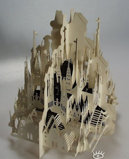


Since the art selling in the gallery is paper art. So the fundamental idea of my design is paper and folding. Therefore, my design started with a simple folding structure which echoes with the paper art.

And the reason for the bending at the back is to get the beautiful church and sun set view from the back of the building.

Apart from that, instead of having ordinary entry from King Street. The visitors need to enter the gallery through this converging stair case. The reason of the converging shape is to lead the visitor from the street to the gallery. Simply like an arrow. And there is an open at the front which can glance through the interior but cannot enter from there and this increase the curiousness of the people and attract them to get in.
Interior:


The stock room is located at the middle of the workshop level and the ground level. Since it is a space serves as a public and private use. (The owner will need to get the material and his stuff from there, but on the other hand the material will be delivered from the car park and put it there.) It serves as a linkage between a public and private area in the gallery. And this is the reason why it is located at the middle of both levels and next to a car park.


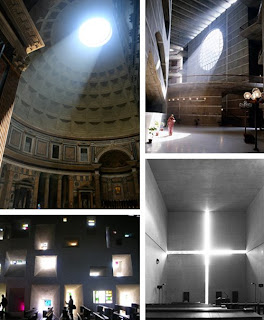
Since my case study is the Kimbell art museum. I investigate the idea of light resource from Louis Kahn. For him, the impact of light serves as the first theme for architecture. Therefore, I transform the idea of the usage of light from the museum into my design.The light can pass from the roof and go down onto both levels.The light will bounce from the wall and onto the other side of the gallery where the art works are located. And this can prevent the direct contact from sun light which will damage the quality of the art work. Also there is an opening at the back of the gallery, and it also direct the light onto both level.

Furthermore, the level at back of the gallery can also be separated into two degree of usage. The lower part is more commercial and public area, which the visitors and the owner can gather and talk under a shelter. And for the upper part is the area for the private use. The bedroom and the workshop are located there. And these two rooms will have a beautiful view from the back, and stimulate the creativity of the owner.Moreover, these two rooms link directly to the entrance of the gallery. The owner can pass through a bridge and back to his private space directly. And at the upper part of the gallery, the bridge is the only way that connects to the bedroom and workshop, so this increases the privacy of the owner. And at the front of the bedroom there is a large opening that allows the owner to observe the gallery.These two openings echo with each other. They are some how separated but also some how connected.

Model with Site:

In order to create a building which echoes the surrounding rectangular-box-like building. The gallery was constructed with a simple longitudinal shape.

And for my design we can general separate the function into two parts. A displaying gallery located at the front part and a commercial and self-usage area at the back. And between these two parts, an opening courtyard is located at the middle. And the courtyard serves as a resting and separating function. After the visitors have enjoyed the art, they can have rest and discussion there. And the courtyard is more serve as linking the sequence of space. And beside the courtyard, there is also a sheltered corridor which serves as a direct linkage between two parts. The counter of the shop and the commercial office are located at the back of the gallery.


